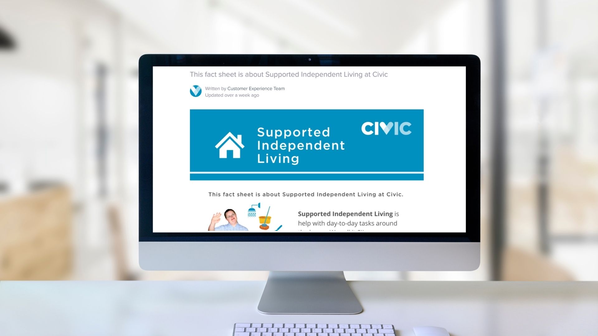
Over the past 12 months, we’ve been developing more and more ‘Easy Read’ tools. But what exactly is Easy Read, and why is it important?
Have you ever stopped to think about what communication is? If you think communication is all in the telling – you send an email, deliver a presentation – then think again. Communication is only complete once the information has been delivered, received and, most importantly, understood. In fact, access to information in a way we understand it, is a human right, and one that is highlighted in Articles 9 and 21 of the Convention on the Rights of Persons with Disabilities (CRPD). But the way in which we deliver information, has a huge bearing on how, if at all, that information is understood.
This is where Easy Read comes in.
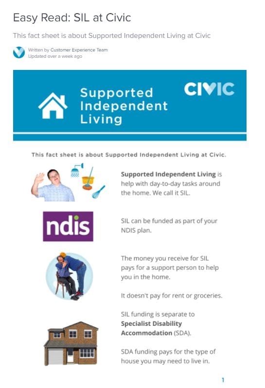
Easy Read is a form of written communication, that uses conversational language and pictures to explain meaning. It has been developed to promote and protect human rights through accessible information, increasing a person’s ability to understand information, make choices and be part of their community. And while it’s been developed for people with intellectual and other disabilities, low literacy and those learning English, there’s a growing body of evidence that Easy Read can support everyone in understanding key messages and actions – including the time poor and the elderly.
As we’ve navigated environmental emergencies, a global pandemic and are now looking ahead to the largest vaccination program in Australian history, access to information has never been more important. Increasingly, organisations such as the Department of Health – and Civic – are placing importance on developing accessible communications, including Easy Read tools, that can be used to support those with disability in accessing information.

What makes a document Easy Read?
There are, as yet, no official global guidelines in the development of Easy Read documentation, however, there are some standard approaches.
Typically, the information is never longer than 12 pages, is formatted with wide margins, has images on the left and text on the right, using a simple font, no smaller than size 16. Text is written in short sentences, using everyday language. You won’t find any punctuation, including commas and apostrophes in Easy Read, and acronymns are avoided. Formatting such as underlining and italics is also avoided, and headings are minimised.
We all know the saying ‘A picture says a thousand words,’ and pictures are critical to Easy Read documentation. Ideally, documents use photos, taken from libraries such as PhotoSymbols, to illustrate concepts. Where a suitable photo can’t be sourced, it should be removed.
Testing
An important aspect of developing Easy Read documentation is the testing of the documentation. At Civic, we are introducing a testing panel, involving clients to review each resource we develop, to ensure the final document contains text and images that support all our clients in absorbing critical information.
At Civic, we are committed to providing information in a way that can be understood, and we encourage you to make use of the Easy Read resources that have been developed internally, or made available by other organisations such as the Department of Health. You can access some of our existing Easy Read resources in our online Knowledge Centre.


